

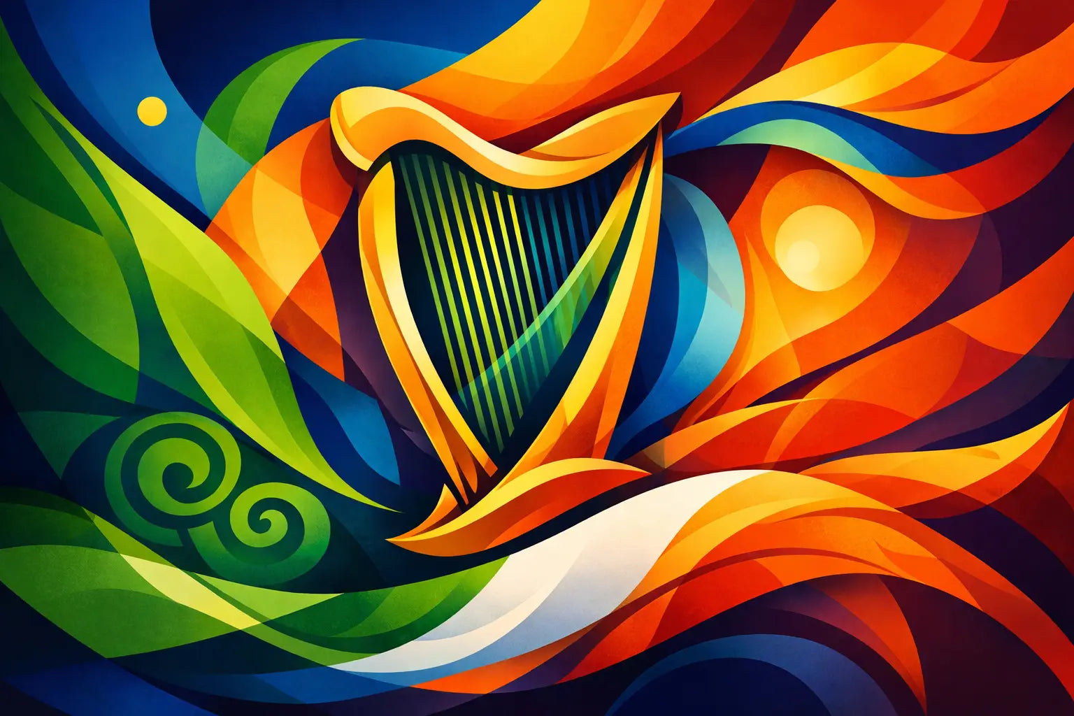
A harp on your chest, cap or chain is never just decoration. It carries music, memory, sovereignty and the long refusal to be flattened into somebody else’s idea of Ireland. This Irish harp symbol style guide is for wearing that meaning with intent - not turning it into novelty Celtic merchandise.
The rule is simple: know what you are carrying, then make it your own. The Irish harp belongs in the past, but it does not have to look like it lives there.
The Irish harp is a national emblem, not a filler graphic
The harp has represented Ireland for centuries. Its roots reach back through Gaelic culture and the travelling harpers who held history in music long before it was neatly recorded in books. Over time, it became a symbol of Irish identity, appearing on coins, official emblems and flags of resistance.
That weight is exactly what gives the symbol its power. A shamrock can be cheerful. A harp makes a statement.
For a modern wardrobe, treat it like a signature rather than background pattern. One clean harp mark on a heavyweight tee or the side of a cap carries more confidence than an all-over print of faux-medieval knots. Scale matters. So does breathing room. Let the shape hold its ground.
This does not mean every use needs to be solemn. Irish identity has always had humour, style and contradiction in it. But the difference between a piece with edge and a souvenir-shop cliché is usually restraint. Avoid loading the harp with every expected extra: tricolours, castles, leprechauns, beer references and decorative scrollwork. Pick a lane.
Start with the right harp shape
Not every harp silhouette says the same thing. The most recognisable Irish form is a cláirseach, or Gaelic harp: a compact, curved instrument with a strong pillar, a rounded soundbox and a sweeping neck. It is distinct from the taller orchestral concert harp often seen in formal music settings.
For graphic design, clarity wins. The silhouette should still read at a glance when embroidered small, stamped into metal or printed in one colour. Fine strings and ornate carving can look beautiful on a large back print, but they often disappear in embroidery or become visual noise on jewellery.
A stripped-back silhouette works best for streetwear. Keep the neck and pillar clear. Use strings sparingly where scale demands it. If the design needs more detail, put it where people can actually see it: a large chest graphic, a back panel, or a pendant with enough surface to hold the linework.
There is one caveat. If you are reproducing an official version of the harp, accuracy is not optional. Ireland’s State harp is a specific emblem, with recognised proportions, colours and orientation. It should not be treated as a generic clip-art asset, particularly for commercial use. A heritage-inspired cláirseach gives more room for expression while avoiding the claim that a garment is official.
Colour should sharpen the message
The classic State treatment is a gold harp with silver strings on a blue field. It is formal, unmistakable and full of institutional weight. Used cleanly, it can look sharp on a navy sweatshirt, a deep blue football-style jersey or a structured cap.
But heritage is not limited to one palette. Black on washed charcoal creates a quieter, harder look. Cream ink on forest green feels rooted without being costume-like. A single metallic gold harp on black jewellery packaging or a dark tee reads confident, provided the finish stays restrained.
Think about the relationship between colour and context. Green, white and orange together are immediately political and national. That may be exactly the point. It may also overpower a design that only needs a nod to Ireland. There is no neutral answer here. The tricolour means something. Use it deliberately, not because it is the quickest visual shortcut.
For an everyday piece, one or two colours are usually enough. Let the harp do the talking. For a bolder drop, contrast the emblem with an unexpected streetwear colour - cobalt, faded red, off-white or acid green - while keeping the mark itself clean.
Placement changes everything
Where the harp sits tells people how it is meant to be read. A small left-chest mark has the feel of a badge: personal, close, part of the wearer rather than a performance for the room. A centre-chest print makes the symbol confrontational and direct. On the back, it becomes a banner.
The same principle applies to accessories. A small embroidered harp on a flat cap feels like inherited style reworked for the street. A cuff, signet-style ring or pendant makes the symbol more intimate. It can be worn daily without asking for attention, yet it is there for those who recognise it.
On jerseys, the harp belongs where a crest would belong: over the heart, high on the chest or as a disciplined central badge. Give it the respect of a club mark. Avoid placing it low, tiny or squeezed between oversized slogans. If you pair it with text, keep the type modern and decisive. Irish language phrases, a place name or a short line with bite can work. Decorative Gaelic-style fonts usually do not.
Irish harp symbol style guide: respect the details
A few choices separate cultural confidence from careless styling.
First, do not confuse the Irish harp with a generic Celtic fantasy motif. The real symbol already has enough history. It does not need dragons, runes or invented mythology attached to it.
Second, be careful with orientation. The State harp and the Guinness harp are famously shown facing opposite directions. That difference is not a design trivia game. If a reference is intentional, make sure it is accurate. If it is not, use an original harp illustration and avoid implying an official connection.
Third, consider production before committing to the artwork. Thin lines that look perfect on a screen may fill in during embroidery. Fine silver string details may vanish when engraved at a small scale. Screen print, embroidery, woven patches and metal each ask for a slightly different version of the same mark.
Finally, leave room for the symbol to exist without explanation. A good harp design does not need paragraphs of heritage copy printed around it. Meaning lands harder when the garment gives the viewer something to meet halfway.
Pair heritage with a modern uniform
The easiest way to make the harp feel current is not to over-style it. Wear a small harp tee with loose denim and clean trainers. Put a tonal cap over a plain overshirt. Let a harp pendant sit against a white tee, a black knit or an open collar. The contrast is the point: old symbol, current silhouette.
For a more expressive look, build around one heritage piece rather than several. A retro jersey with a harp crest can carry the outfit. Keep the rest stripped back. If you choose a bold gold pendant, skip competing chains and oversized logos. Identity does not need to shout from every surface to be visible.
This matters especially for the diaspora. You do not need to dress like a postcard from Ireland to claim your connection. A harp can be a quiet nod to family, language, place, politics or the feeling of being from somewhere even when you are far from it. Wear it in Manchester, Melbourne, Boston or Belfast. It still speaks.
Make it yours, without making it smaller
The harp has survived because it has never been only one thing. It has been royal and radical, official and outlawed, refined and fiercely popular. That tension is useful. It gives modern Irish design permission to be polished without becoming polite.
EIRIN approaches heritage the same way: not as something behind glass, but as something you can wear out the door. A well-made harp piece should feel like a marker of where you stand, not a costume you put on for a themed night.
Choose the version that fits your voice. Go minimal if you want the meaning to sit close. Go bold if you want the room to understand immediately. Just keep the symbol clear, the design honest and the attitude your own. The harp has carried Ireland through enough history. Let it carry some of yours.


![Eirin Apparel Claddagh Earrings Chunky Gold-Plated Claddagh Hoop Earrings – 'Soláis' (Sunlight) [collection-cover-only]](http://eirin.co/cdn/shop/files/eirin-apparel-claddagh-earrings-chunky-gold-plated-claddagh-hoop-earrings-solais-sunlight-1260024173.png?v=1790378984&width=1254)

![Eirin Apparel Claddagh Earrings Chunky Silver-Plated Claddagh Hoop Earrings – 'Réalta' (Starlight) [collection-cover-only]](http://eirin.co/cdn/shop/files/eirin-apparel-claddagh-earrings-chunky-silver-plated-claddagh-hoop-earrings-realta-starlight-1260024174.png?v=1790378955&width=1254)

![Eirin Apparel Claddagh Earrings Dainty Gold-Plated Claddagh Hoop Earrings – 'Gríanóg' (Little Sun) [collection-cover-only]](http://eirin.co/cdn/shop/files/eirin-apparel-claddagh-earrings-dainty-gold-plated-claddagh-hoop-earrings-grianog-little-sun-1260024172.png?v=1790379015&width=2048)

![Eirin Apparel Claddagh Earrings Gold-Plated Sterling Silver Claddagh Earrings – ‘Croi Óir’ (Golden Heart) [collection-cover-only]](http://eirin.co/cdn/shop/files/eirin-apparel-claddagh-earrings-gold-plated-sterling-silver-claddagh-earrings-croi-oir-golden-heart-1260024175.png?v=1790378802&width=2048)

![Eirin Apparel Claddagh Earrings Celtic Knot Claddagh Earrings – ‘Fáinne an Ghrá’ (Ring of Love) [collection-cover-only]](http://eirin.co/cdn/shop/files/eirin-apparel-claddagh-earrings-celtic-knot-claddagh-earrings-fainne-an-ghra-ring-of-love-1260024176.png?v=1790378776&width=2048)

![Eirin Apparel Women's Earrings Women's Irish Harp Earrings – 'Fuaim' (Sound) [collection-cover-only]](http://eirin.co/cdn/shop/files/eirin-apparel-women-s-earrings-women-s-irish-harp-earrings-fuaim-sound-1260024177.png?v=1790378295&width=2048)

![[collection-cover-only]](http://eirin.co/cdn/shop/files/L1.png?v=1792801400&width=1254)

![[collection-cover-only]](http://eirin.co/cdn/shop/files/S1.png?v=1792801344&width=2048)


![Eirin Apparel Claddagh Ring Women's Sterling Silver Gold Claddagh Ring – 'Grá Geal' (Radiant Love) [collection-cover-only]](http://eirin.co/cdn/shop/files/eirin-apparel-claddagh-ring-women-s-sterling-silver-gold-claddagh-ring-gra-geal-radiant-love-1260797132.png?v=1790983180&width=1254)

![Eirin Apparel Claddagh Ring Women's Gold-Plated Classic Claddagh Ring – ‘Gréine’ (Of the Sun) [collection-cover-only]](http://eirin.co/cdn/shop/files/eirin-apparel-claddagh-ring-women-s-gold-plated-classic-claddagh-ring-greine-of-the-sun-1260024155.png?v=1790378897&width=1254)

![Eirin Apparel Claddagh Ring Women's Silver-Plated Classic Claddagh Ring – ‘Gealaí’ (Moonlight) [collection-cover-only]](http://eirin.co/cdn/shop/files/eirin-apparel-claddagh-ring-women-s-silver-plated-classic-claddagh-ring-gealai-moonlight-1260024154.png?v=1790378925&width=2048)


